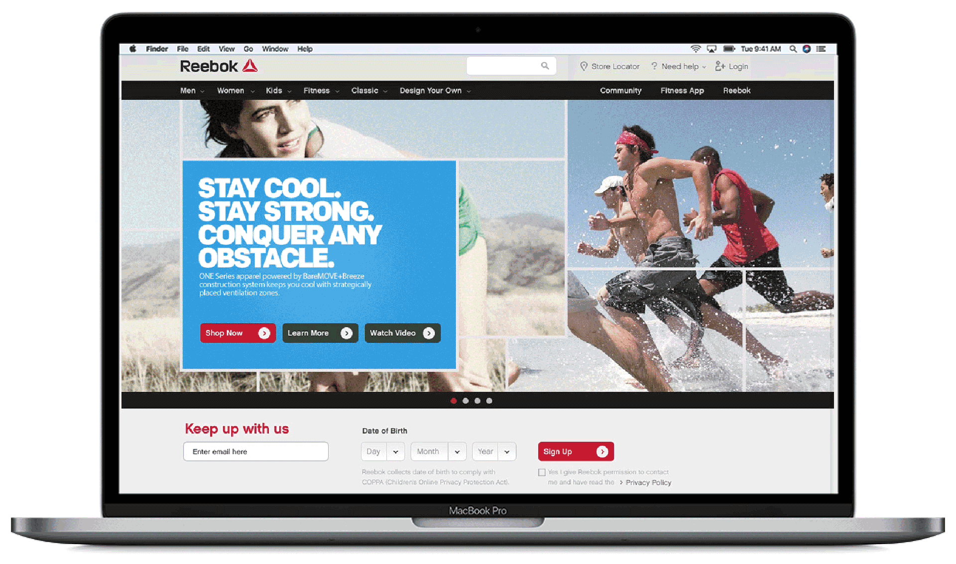
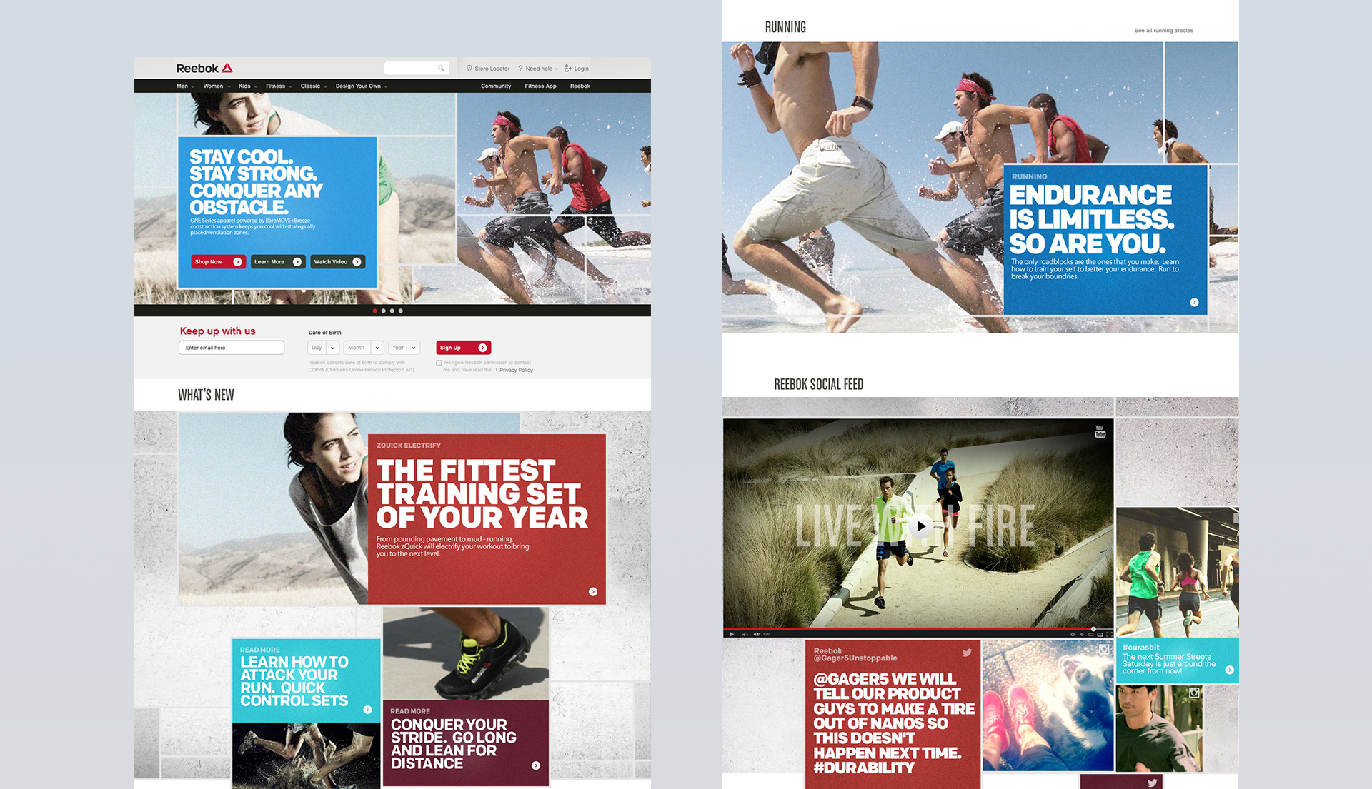
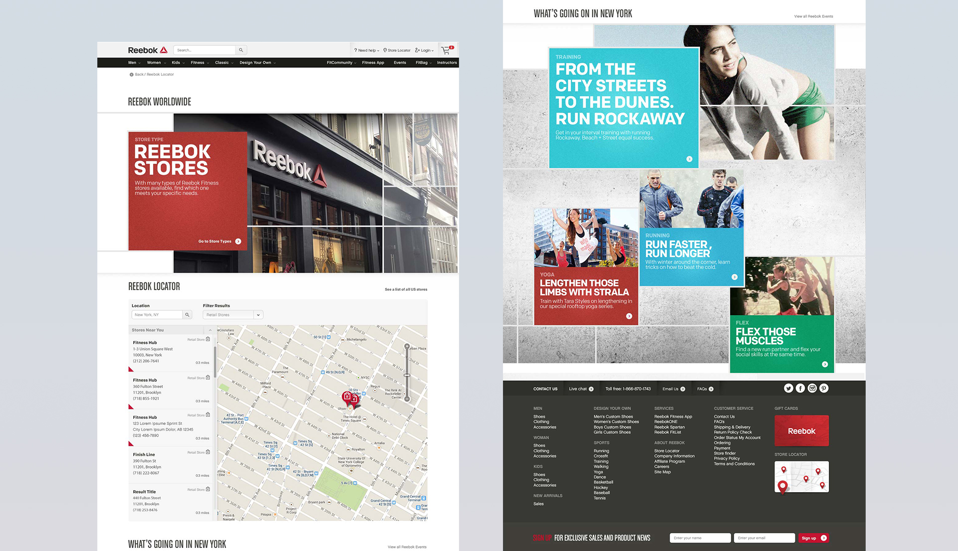
Working with the experiential design director to help conceptualize and design the campaign section of Reebok.com. The Project evolved over 8 months of development, with a large focus on how typography could be flexible across the modular based site and then continue to be consistent in over 29 languages. The leading discussions on typography were to keep the campaign as close to the print as possible; we felt we rose to the challenge in designing a typography break point system based on character counts.
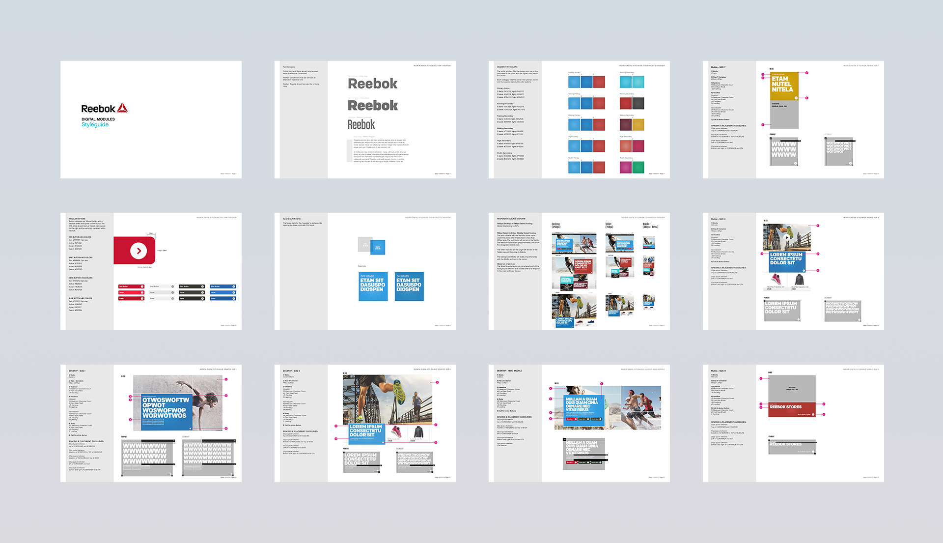
A rebranding of the Reebok online brand to target the everyday athlete, this was also coupled with full style guide creation including color theory that was handed off to Reebok worldwide to incorporate into their global style guide.
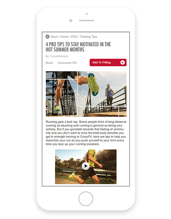
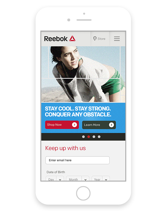
A modular system was built to hold the myriad of content that was intended to flex across sections. Color theory was tied to each of Reebok’s sub brands.
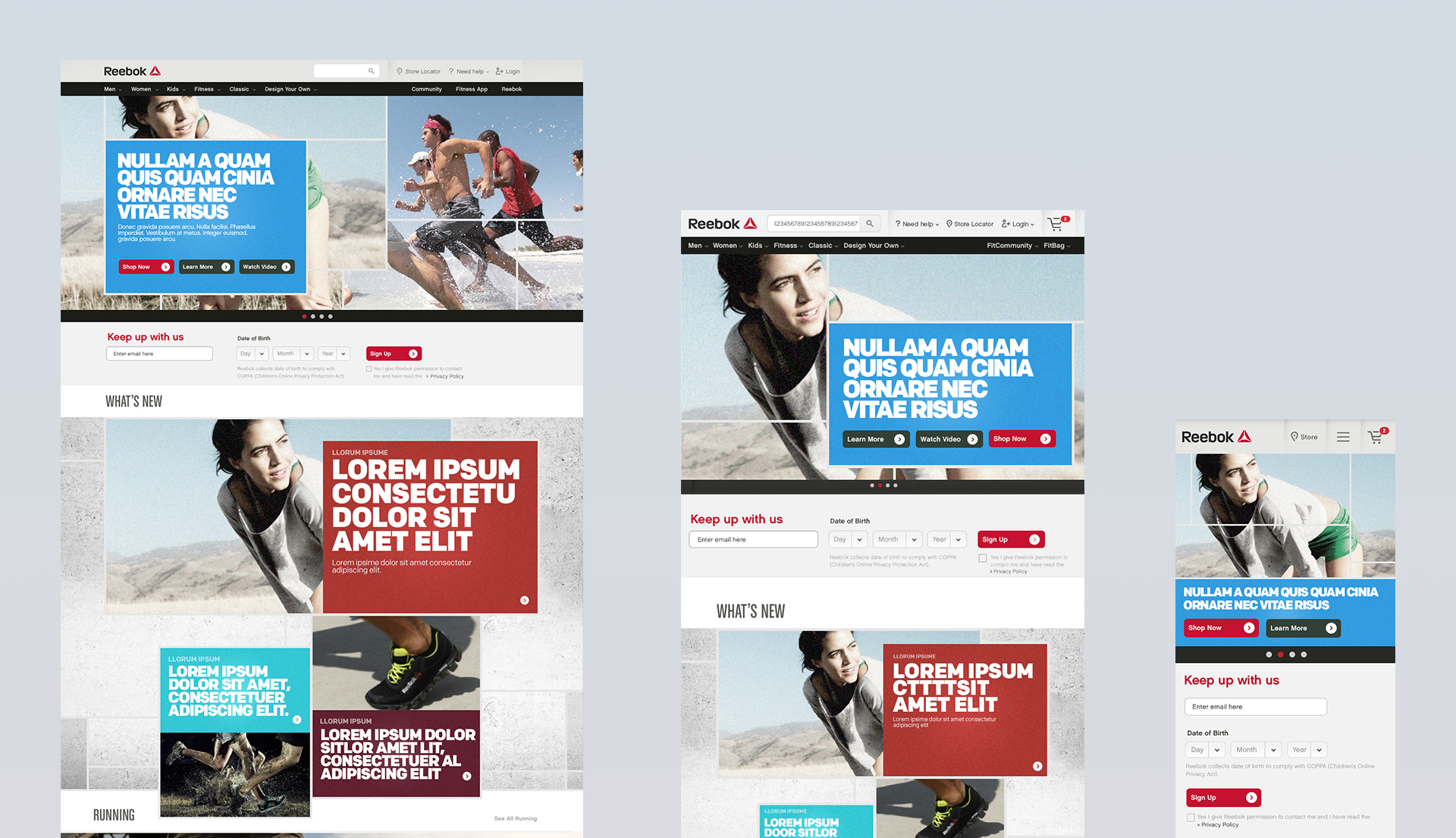
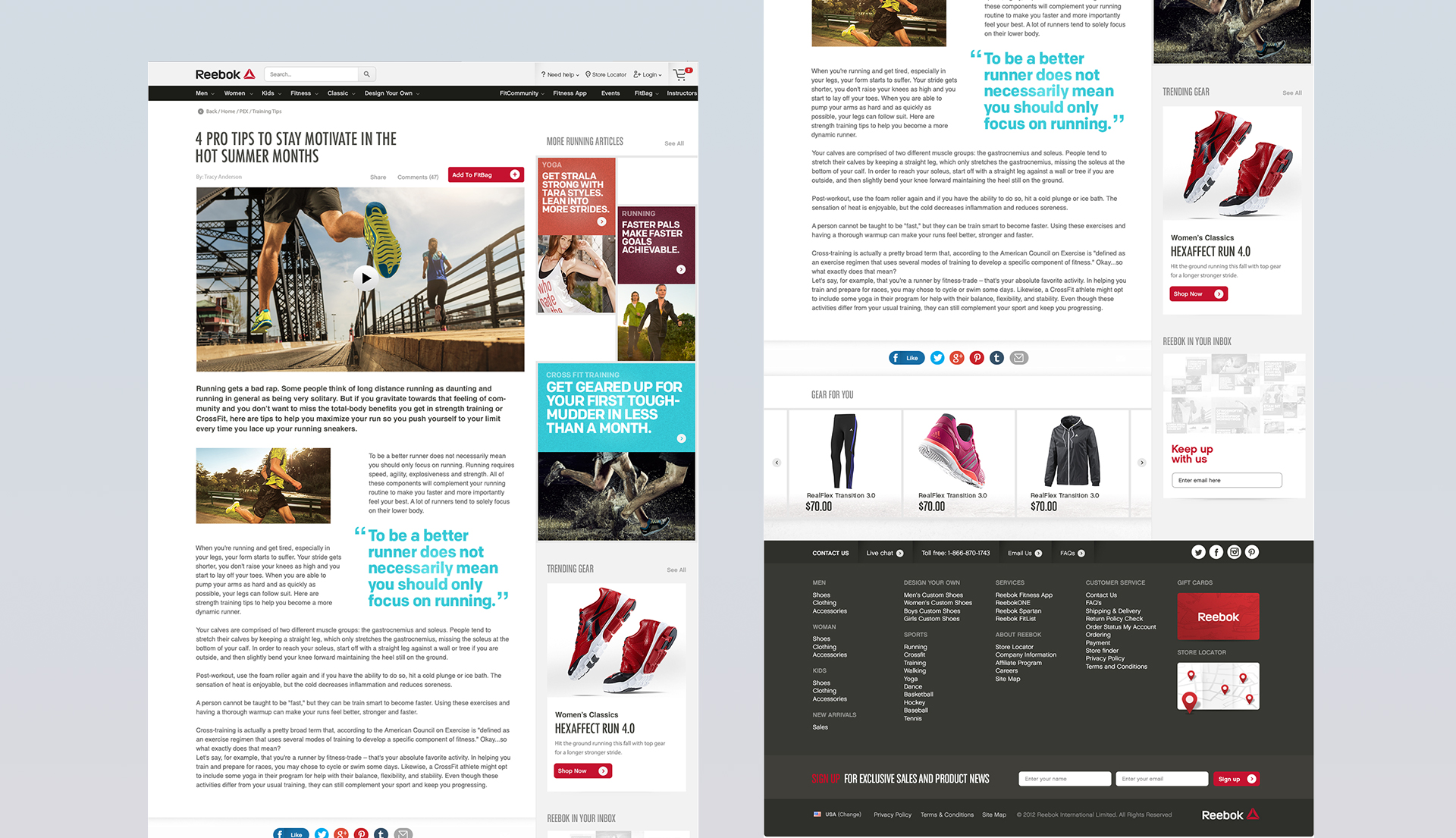
Both brand guidelines as well as color and type guides were built into a large system guide to aid in communicating the new Reebok design system.